Reimagining calendar productivity for Lightning Experience
Salesforce’s shift from the classic Aloha interface to Lightning Experience unlocked a chance to rebuild core productivity tools. Our team set out to craft a new calendar from scratch that could juggle meetings, tasks, and record-driven events without sacrificing performance or clarity.
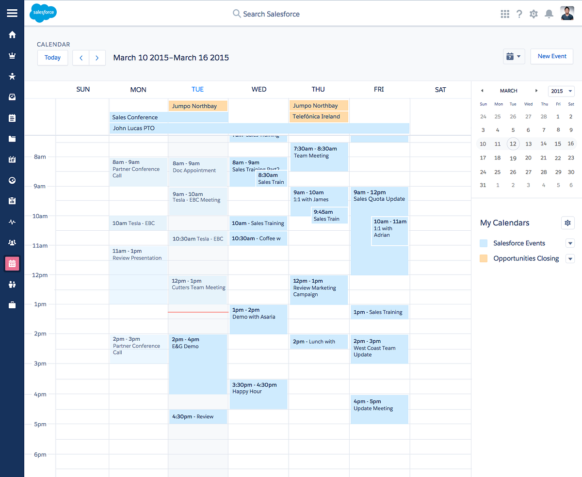
As the lead front-end developer I owned the build from the ground up, translating ambitious design explorations into production-ready code. Handling overlapping events, multi-day scenarios, and locale-sensitive time math demanded meticulous layout logic and a11y-first interaction patterns—the work ultimately yielded patents and the first fully accessible calendar on the web.
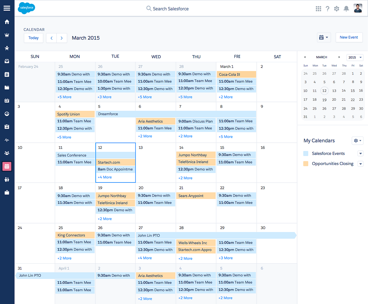
Off-the-shelf calendar frameworks looked tempting, yet internal security, licensing constraints, and the depth of customization we needed made a bespoke solution the smarter path. Building it ourselves let us optimize rendering performance, integrate deeply with Salesforce data, and keep the experience resilient under heavy enterprise workloads.
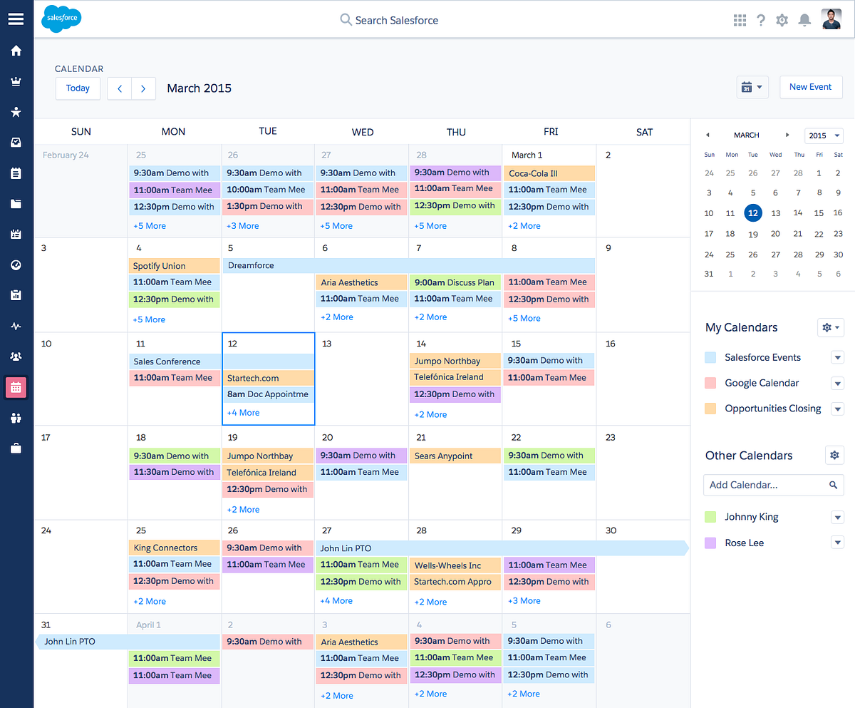
After launch the platform continued to evolve—color-coded calendars, smart filters, and richer context cards layered on top of the core foundation. Because we had full ownership of the stack, the enhancements slotted in without rewriting the architecture.
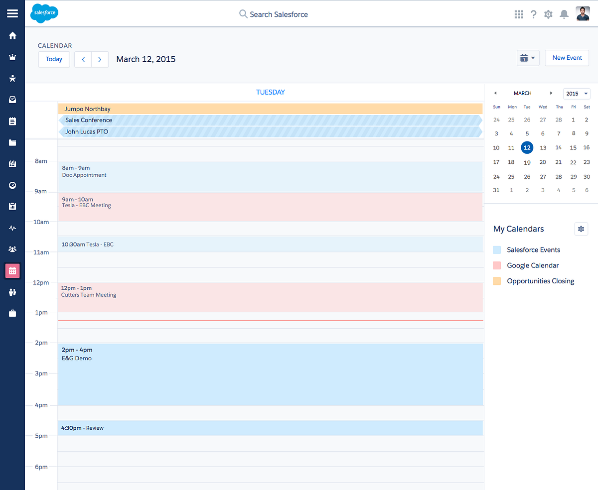
Lightning Calendar flexed between day, week, and month views while staying responsive and keyboard friendly. We tuned virtualization and focus management so power users could move between dense time horizons and still keep context.
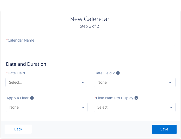
Inline creation flows let anyone spin up calendars, share them with teams, and author events without losing their place. Prototyping the markup and CSS alongside interaction logic helped us land on a system flexible enough for admins yet approachable for first-time users.

